GOGEST
From SaaS-tastrophe to UX Wonder:
Turning Chaos into User Joy
About the project
Gogest is a business management solution designed to optimize data integration and sharing via the Cloud.
This case study highlights the redesign, which improves accessibility, streamlines efficiency, and elevates user satisfaction, all while enhancing the software's performance.
-
Industry
IT/ SaaS
-
Company
Hes Inovação
-
Date
February-March 2024
-
My role
Ux researcher and UX Designer
Main goal
The goal is to enhance Gogest by making it more accessible, efficient, and enjoyable to use, boosting customer numbers, satisfaction, and the overall effectiveness of the software.
Houston, We Have a UX Problem!
- - Who: The users of the software
- - What: A decline in software usage and an increase in customer complaints and bugs. This has resulted in rising costs for the company
- - Where: Desktop version of the software
- - When: The drop in usage and surge in complaints occurred after the latest software changes and the release of the mobile version.
- - Why: The recent changes likely disrupted user workflows or introduced new usability issues, leading to bugs, user frustration and dissatisfaction.
Sherlock Holmes Mode
Questions to answer
- - Why has the number of complaints to customer service increased?
- - Why don't all employees of the companies that sold the software use Gogest?
- - What is the adhesion to the software? Or what they think of the software?
- - Is the software intuitive?
Hypotheses
I formulated these hypotheses by first gathering insights from research competion analysis and from the customer support team, where I identified patterns in user complaints and bugs. Based on these insights, I developed the follow hypotheses:
- - Changing the software navigation will make it easier to use
- - UX writing :If change the technical terms in the software and use more simple words, it will be easier to find what the user is looking for
- - Redesign the UI: Better colors to read better and more accessible
Desk research
A competitive analysis of Gogest's competitors was carried out. Several software programs were tested to make a side-by-side comparison and try to understand what differentiates Gogest from the competition's software.
User research
- - Total: 13
- - Stakeholders interviews: 2
- - Support customer and techicians interviews: 4
- - User interviews: 7
- -- How: Video call and face-to-face
- -- Time: 1h to 1h30 minutes
- -- Type of interview: a semi-structured interview was adopted, as it allows for a more assertive approach to the interview and gives the interviewee some freedom to talk about things that are not in the script, which can provide new insights for the research.
Findings/insights
- - Users find it difficult to navigate the software because they have difficulty performing tasks, cannot find them or have too many steps to complete the task.
- - Users praised the fact that everything is concentrated in one place and they don't need to go to multiple platforms to carry out their daily management tasks
- - Slowness in the software
- - Bugs reported that are not fixed
- - Lack of support from the company in using the software, as a good portion of those interviewed created internal manuals for using the software
- Multiple users profiles, each with their own unique characteristics
Problem Decoder: Cracking the Enigma
User story
After analyzing the research and interviews, I determined that multiple user profiles emerged, leading me to create three distinct personas:
Option A
As a tehcnician,I want to use software that performs well and doesn’t lag,
So that I can complete my tasks quickly and efficiently .
Option B
As a plumber,I want the software to be user-friendly and an self-explanatory,
So that So that I can accomplish my tasks effectively without complications
Option C
As a CEO,I want to find software that provides value for money,
So that I can stay within budget while meeting my needs.
Persona
As I said before, based on all the research I've had previously, I decided to choose the persona with less affinity/technological knowledge and education because by focusing on this persona, I ensure that:
- - The design is more inclusive
- - More intuitive
- - User-friendly design that benefits all users
- - Users with less technology affinity may experience more pain points when interacting with complex systems and by focusing on this persona, I address these pain points early on, resulting in a smoother experience for all users
James Smith, a plumber employee and his daily routine from going to the client's home until going to the office and introduce information about his day, hours and how much did he charged to the client.
Empathy map
This empathy map consolidates all the research data and findings to highlight user pain points, helping me identify pain points to better understand user frustrations and find effective solutions.
By mapping out what users say, think, do, and feel, we gained a holistic view of their experiences and needs.
In essence, the empathy map served as our roadmap to creating a more intuitive and effective product, ensuring that every design decision is grounded in real user insights.
User journey
After all the research done in the discover stage, the interviews conducted with users and the data collected, I mapped the user journey to understand what the problem is and how to solve it.
The conclusion reached is that the core of the problem is in onboarding, as there is no monitoring, correct training and follow-up, which leads to dissatisfaction, withdrawal and abandonment of using Gogest.
Having said that, the solution to this problem will be software redesign.
Idea Explosion - Creativity Gone Wild
User flow
This user flow outlines the onboarding journey for SaaS customers, from the moment they start their free trial, the final purchase decision to the onboarding process/adaptation to the software. By simplifying the process and providing helpful guidance, the goal is to minimize user drop-off and maximize engagement, leading users to confidently continue to renew the plan annually.
User journey
In designing the user flow, I aimed to capture and enhance the entire user journey, starting from the initial awareness phase through to the decision to renew their subscription. The user flow begins with awareness, addressing how users first encounter the product and recognize it as a solution to their problems. From there, it transitions to the onboarding stage, where I ensure a smooth and engaging introduction to the software, helping users quickly understand its value and features. This structured approach ensures optimized build trust, enhance user satisfaction, and ultimately encourage long-term engagement with the software.
Information architecture
The old verison, the information architecture organization had several levels, which made navigation confusing and complicated. A new version was created is simplified, with a new organization and words/terms change to make it more intuitive and simple.
Old version
New version
Mad Scientist Lab: Where Ideas Come to Life
Challenge
The software targets small and medium-sized businesses, but older employees, those less familiar with technology, or individuals with limited education may find it difficult to use. The goal is to redesign the software to be more user friendly and more accessible.
Low-fi wireframes
In this case study focuses on enhancements in information architecture, UX writing, accessibility, onboarding process rather than wireframes. Since only a few wireframes were created from scratch, I've included high-fidelity wireframes to illustrate the final design improvements and outcomes.
Design system
IBM’s Carbon design system was used to make it quicker and easier to create high-fidelity wireframes, and IBM Carbon allows us to create excellent, accessible user experiences.
Final design
How did I solved the user needs and problems?
" I can'find anything, it's hard to navigate"
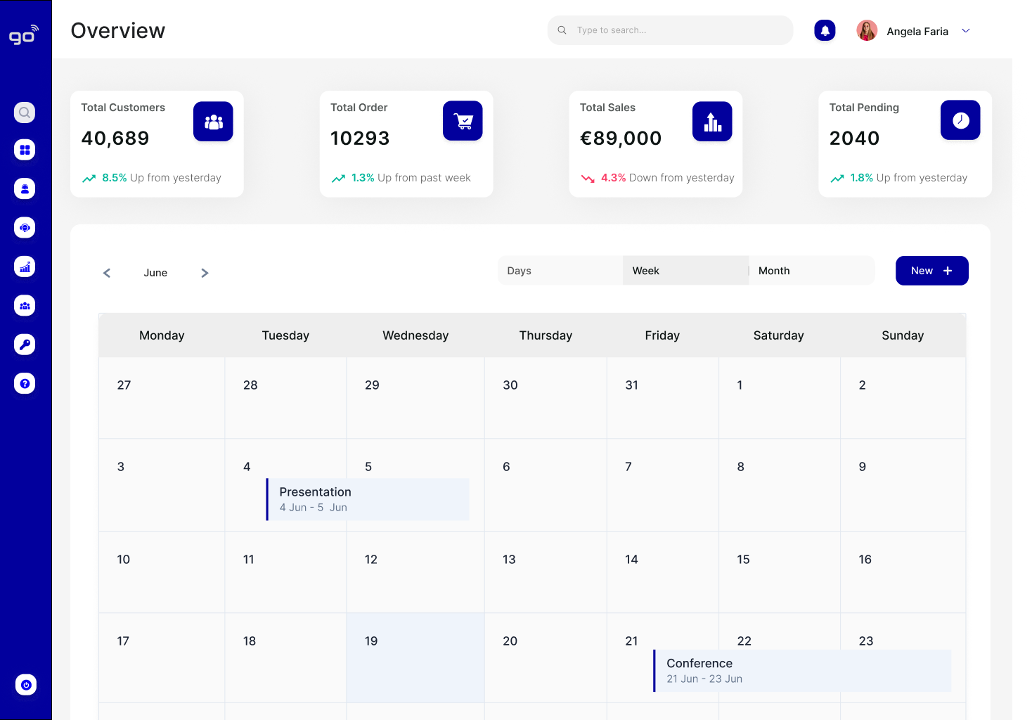
- - First approach: how to improve readability? By changing the information architecture in the header and menu, making navigation more intuitive.
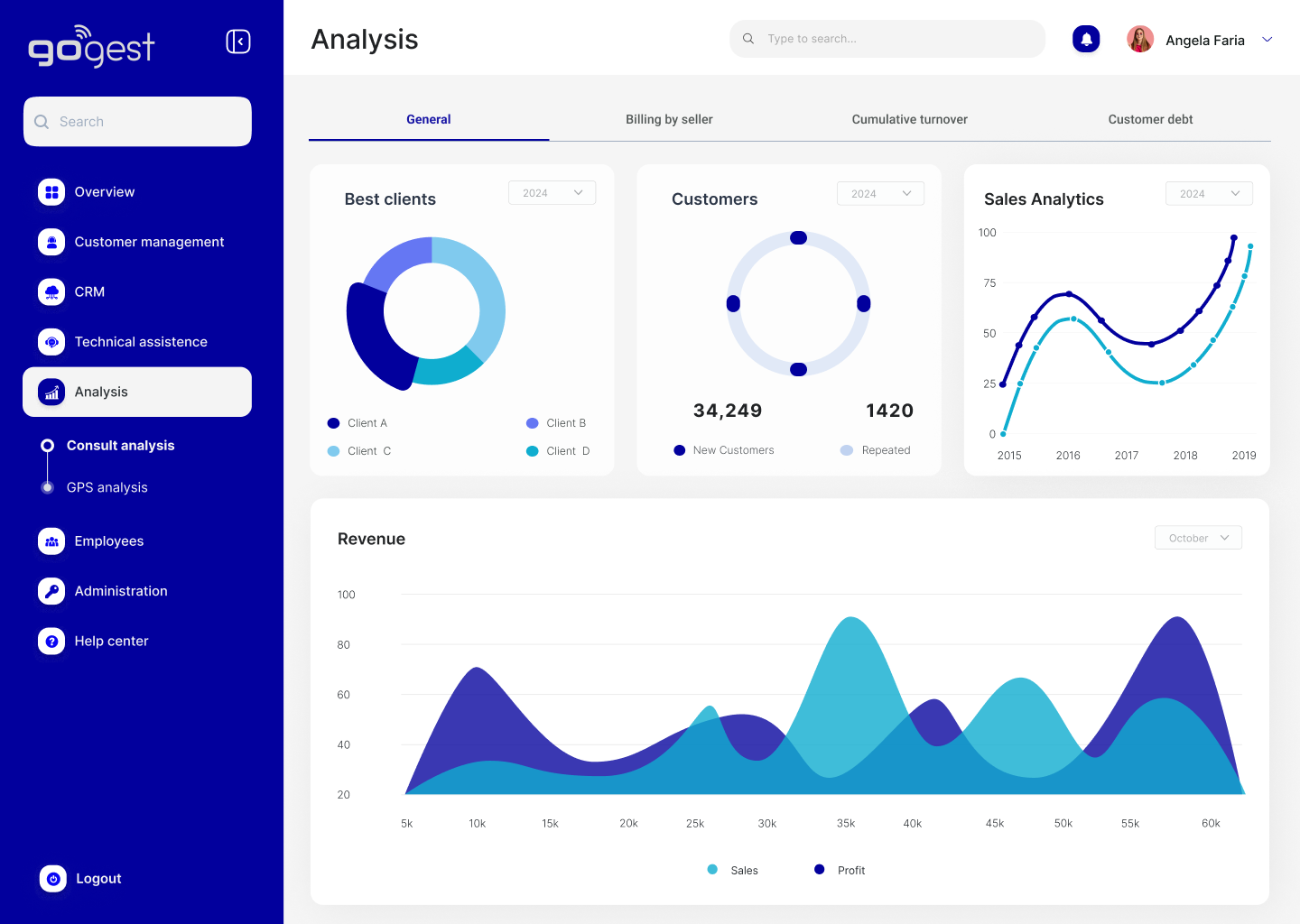
- - I simplified the menus. The menus had several levels, so I reduced them and made the menu smaller. For example, in analyses there were several options for analysis types, so I removed them to just one and when you open the analyses screen, instead of always clicking on the menu, you can navigate the same page through tabs.
- - In addition, the entire UI was redone. The old version used shades of red, which had no contrast or readability. In the new version, colors were used that were easier to read and accessibility practices were adopted.
- - Some search fields were strategically added to make it easier for the user to search, something that was not present anywhere else in the software. They were added to the header, the menu sidebar and the pages that the user is browsing.
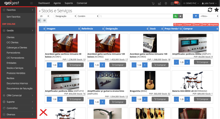
Old version
Non-existent search fields
New version
3 search fields
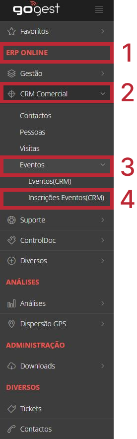
Old version
Multiple levels
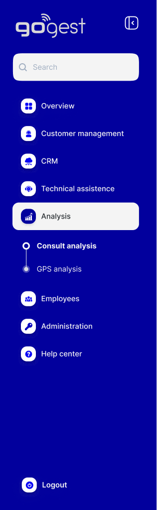
New version
2 levels
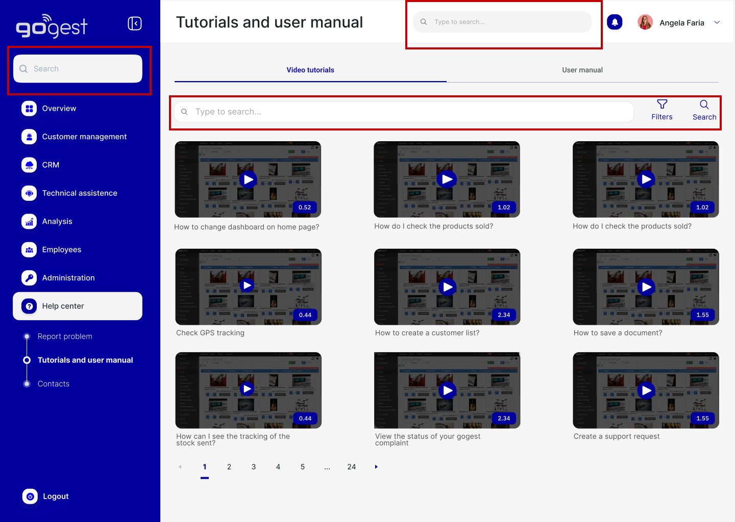
"I had to create gogest user manuals"
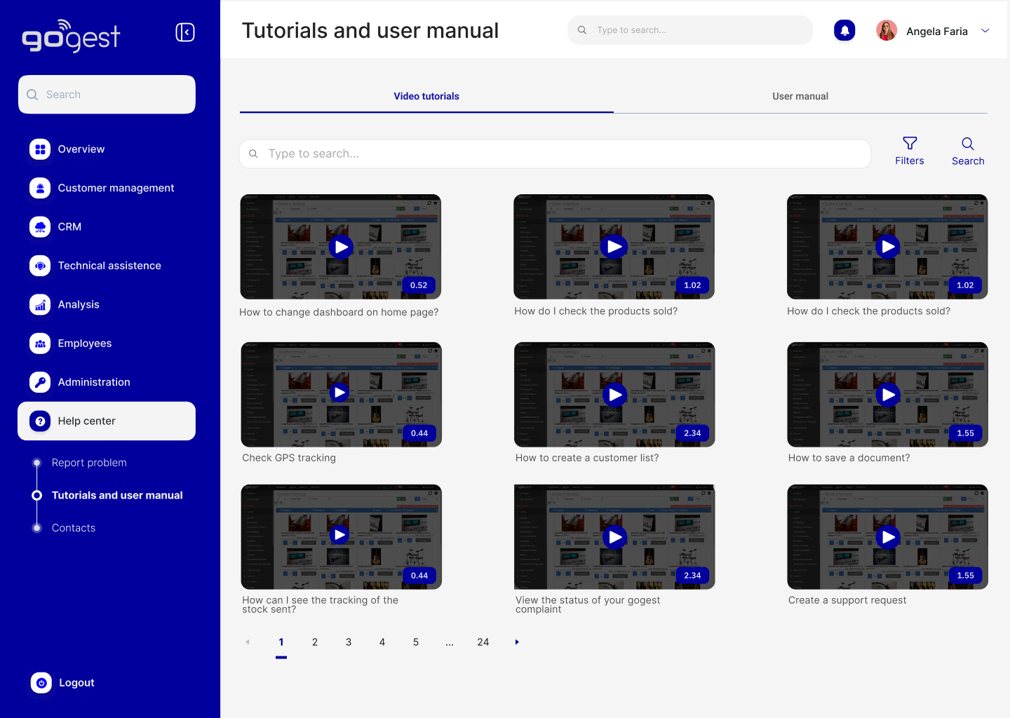
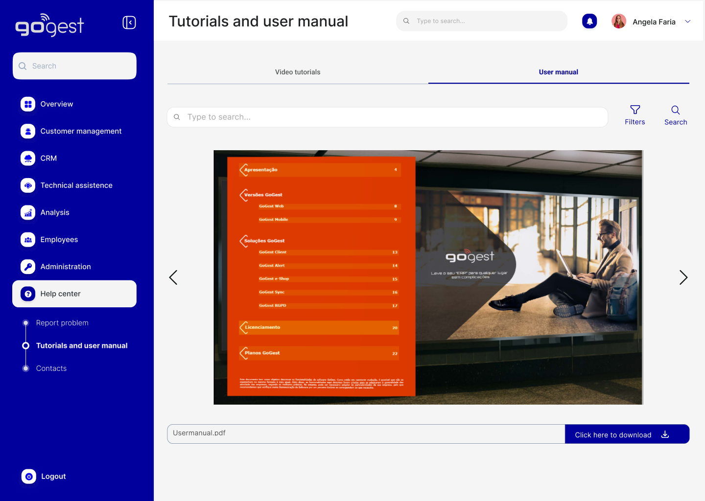
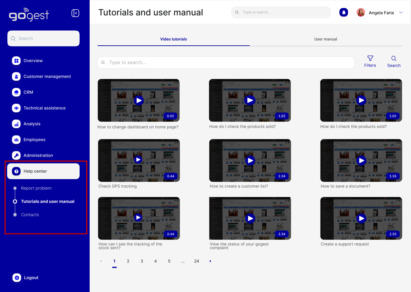
Most users complained that the software was not intuitive and they did not find the manual provided by the company or were not even aware of its existence, So companies created internal manuals. The solution to this problem was to first redesign the Help Center menu and add a "Tutorials" section. In this section, the online manual was added and a unique section for video tutorials/screen recording, was created.
Old version
No tutorial or user manual section in the menu
New version
Created a new help center section and added tutorials and user manual
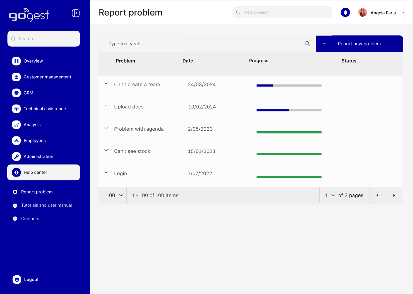
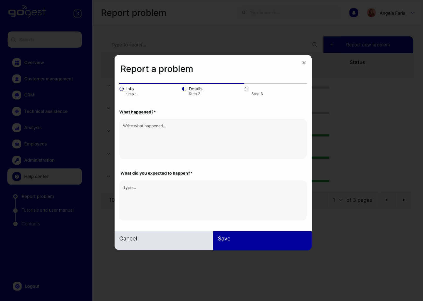
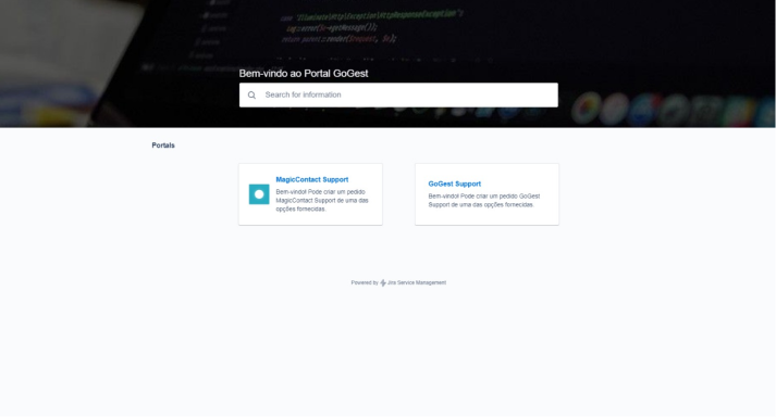
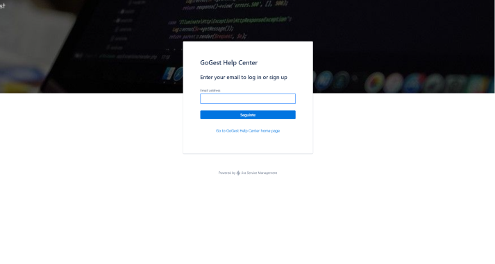
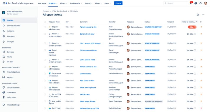
Customers frequently call customer support to report a problem or to find out the status of the process.
In the old version, the customer would click on the Miscellaneous menu, Tickets section and exit the program, ending up on another page and not being able to find any information about the reported problem. In addition, they found it complicated to register a complaint, so they preferred to call to customer support. So a new section was created in my Help Center. On this screen, as you can see, you can report directly to Gogest and track the complaint. You can see whether the complaint has been registered or not, the status of the process and the status of the complaint.
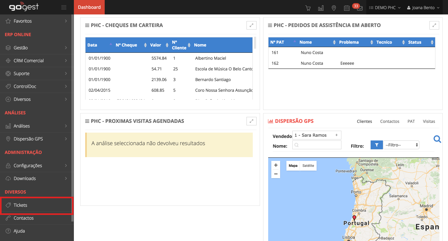
Step 1
Step 2
Step 3
Step 4
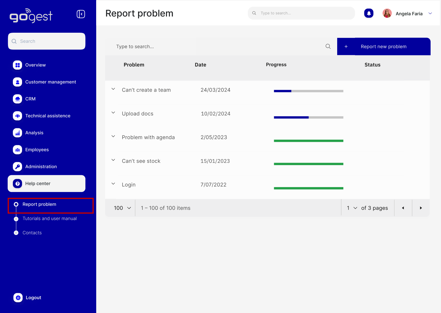
New version
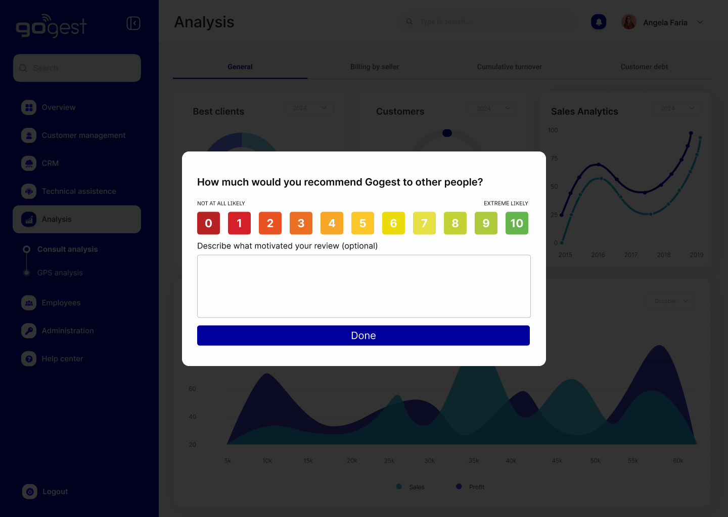
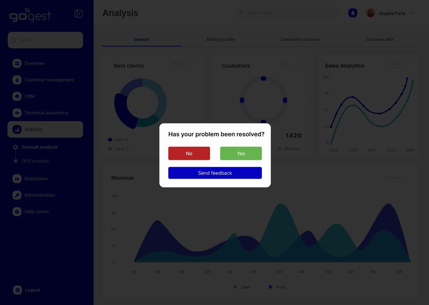
NPS
NPS was created to determine the level of customer satisfaction with the software in general and also NPS for the reported bug/problem. This way, the company can better evaluate the level of customer satisfaction and collect feedback from users.
Next steps: Test
I didn't have the opportunity to test but I would like to do:
- - User testing on hi-fi prototype
- - Do user testing till the new version is ready
- - Next step: After the new version is ready, it would be interesting to conduct usability tests for each topic in the Menu, such as Customer management, CRM, technical assistance, Analysis, etc., to try to understand what difficulties users have and how to help them have a simpler and easier experience